Strong App
Introducing an AI Feature to Check Weightlifting Form
#FeatureAddition
Project Overview
Role: Research & UX/UI Designer
Timeline: 2 Months
Tools: Figma, Miro, Zoom
Methods: Competitive & Comparative Research, User Interviews, Journey Mapping, Storyboards, Personas, User Flows, Task Flows, Mid-Fidelity Wireframing, Usability Testing, Prototyping
Problem: A Need for Direction and Help While Working on Weightlifting Form
Have you ever exercised and wondered if your performance was anywhere close to being correct? You work hard going to the gym day after day wondering if all your hard work is even paying off or even worse fearing that your movement patterns could cause an injury.
What if there was a simple way to check your form on a weightlifting app you were already using? After much frustration of running into this problem myself, I decided to investigate what a solution could look like via the Strong app. During this project, I explored what function AI could have in the fitness app as well as what it looks like to design within the constraints of already existing apps.
Target Audience: Beginner to Advanced Weightlifters
The general target audience is weightlifters of all ages which can be broken down into two personas:
People who are beginner lifters.
People who are advanced lifters.
Project Goals & Objectives:

Solution Preview
Give Users Information at the Right Time
Use popup tooltips to show users the information they need when they need it.
Place forms to fill out within the onboarding flow, rather than directing users elsewhere.
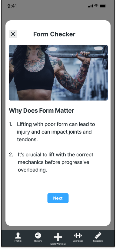
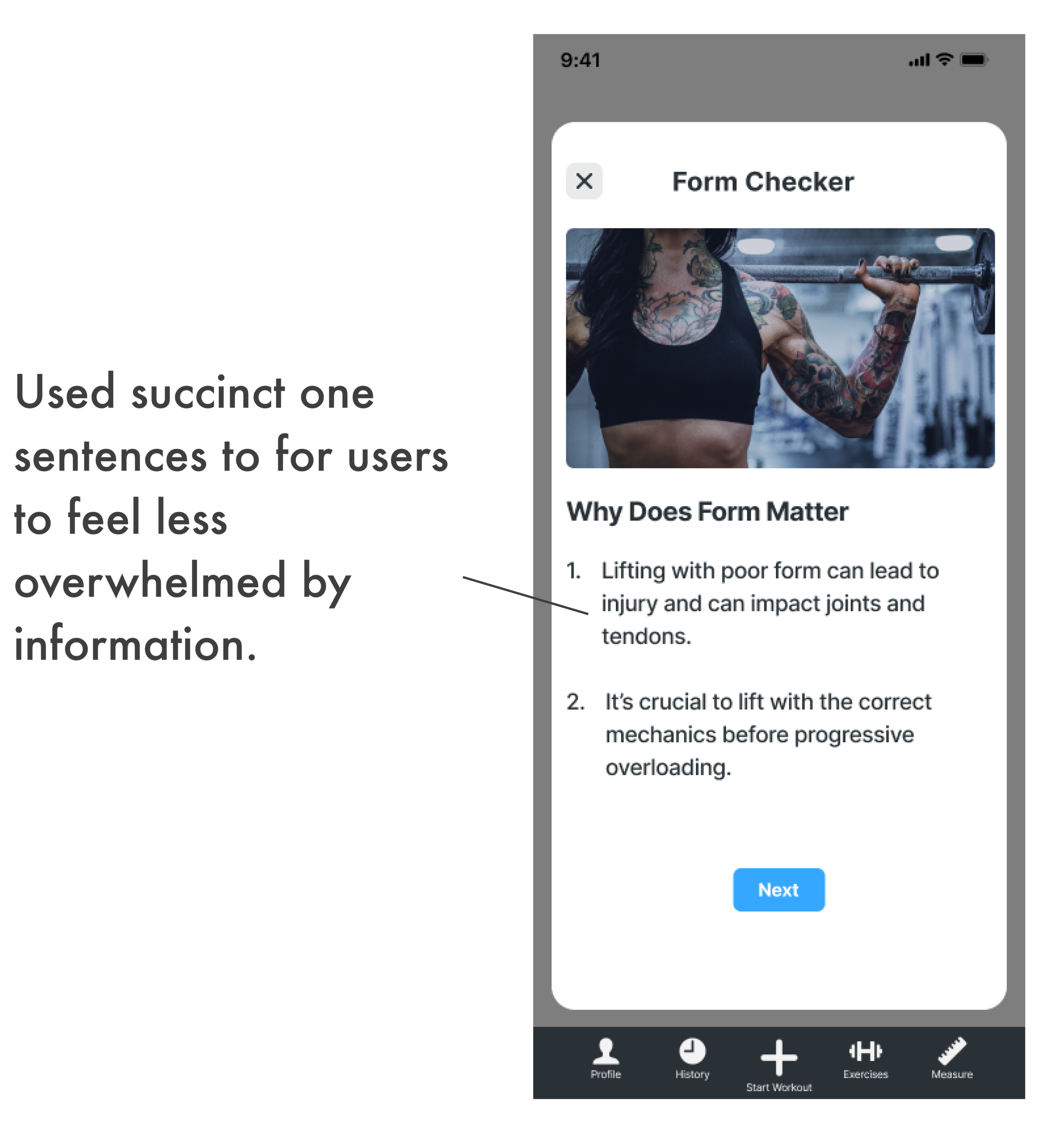
Use succinct, one-line sentences to encourage users to read necessary information.
Create the Context That Different Users Need
Build two user onboarding flows for the beginner and intermediate group as well as advanced lifters.
Give beginner lifters additional context for why form matters and encouragement for filming themselves through tooltips.
Design Within the Existing UI Framework
Maintain the overall look and feel of the existing app being sure not to jolt users out of what they are used to experiencing.
Add a CTA button on the homepage underneath the main workout button rather than creating an entirely new section.
While using the same buttons, change copy to clearly direct users.
Research: Understanding Attitudes about Form
Not Being Swayed by My Personal Experience
Over the last few years, I have fallen in love with the sport of weightlifting, and working on form has been a consistent struggle for me. With this in mind, it was important that I wasn’t led by my own viewpoint and assumptions and instead did the necessary research to uncover if this was a problem that existed for other lifters as well.
Assumptions I Had:
Users want to engage with form improvement as a regular part of their fitness training.
Users would be open to using an app feature to look at their form, trusting it to give them adequate feedback.
A form correction feature on the Strong app wouldn’t feel overwhelming or unnecessary.
Objectives
Understand if users consider form in their weightlifting.
Discover if users feel they have the necessary tools to improve their form techniques.
Finding Opportunity Gaps
There are already a massive amount of apps designed to help users workout. I needed to understand what was available in order to decide if there was a need for a feature such as this and if so, to recognize general design patterns and any opportunity gaps.
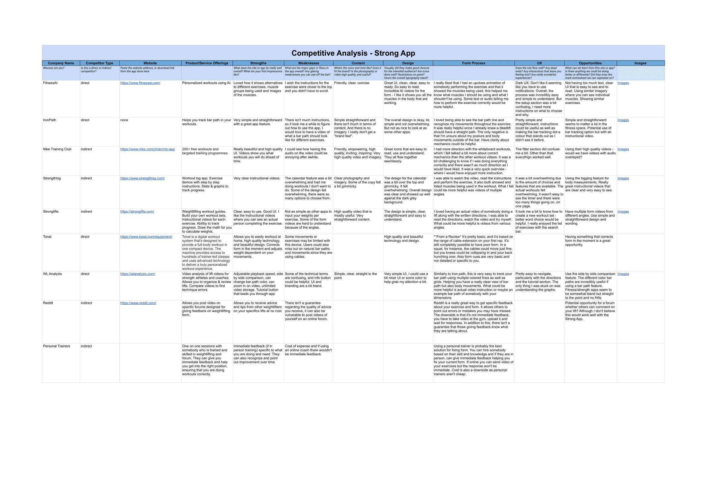
Competitive and Comparative Analysis Takeaways
After reviewing direct and indirect competitors such as FitnessAI, Nike Training Club, Reddit, and Iron Path I was able to gain a clearer understanding of the fitness market as well as the strengths and weaknesses of other competitors.
Many apps lacked clear instructions so using their features was trial by error and time-consuming.
Apps within the fitness industry are not “fluffy”. Generally, they are straight to the point without extra gimmicks or unnecessary add-ons or information.
I was unable to find any apps that gave you a side-by-side view of a user’s own video against an animation, let alone a personalised one. Making this feature a great opportunity that is currently, non-existent.
User Interviews
I spoke with five active weightlifters in order to understand their relationship with form in lifting. Asking questions about motivation, how participants improve form, what prevents them from working on form, and hesitations regarding an app with a form correction feature.

Interview Findings
“A better idea would be to film myself and watch it against another video.”
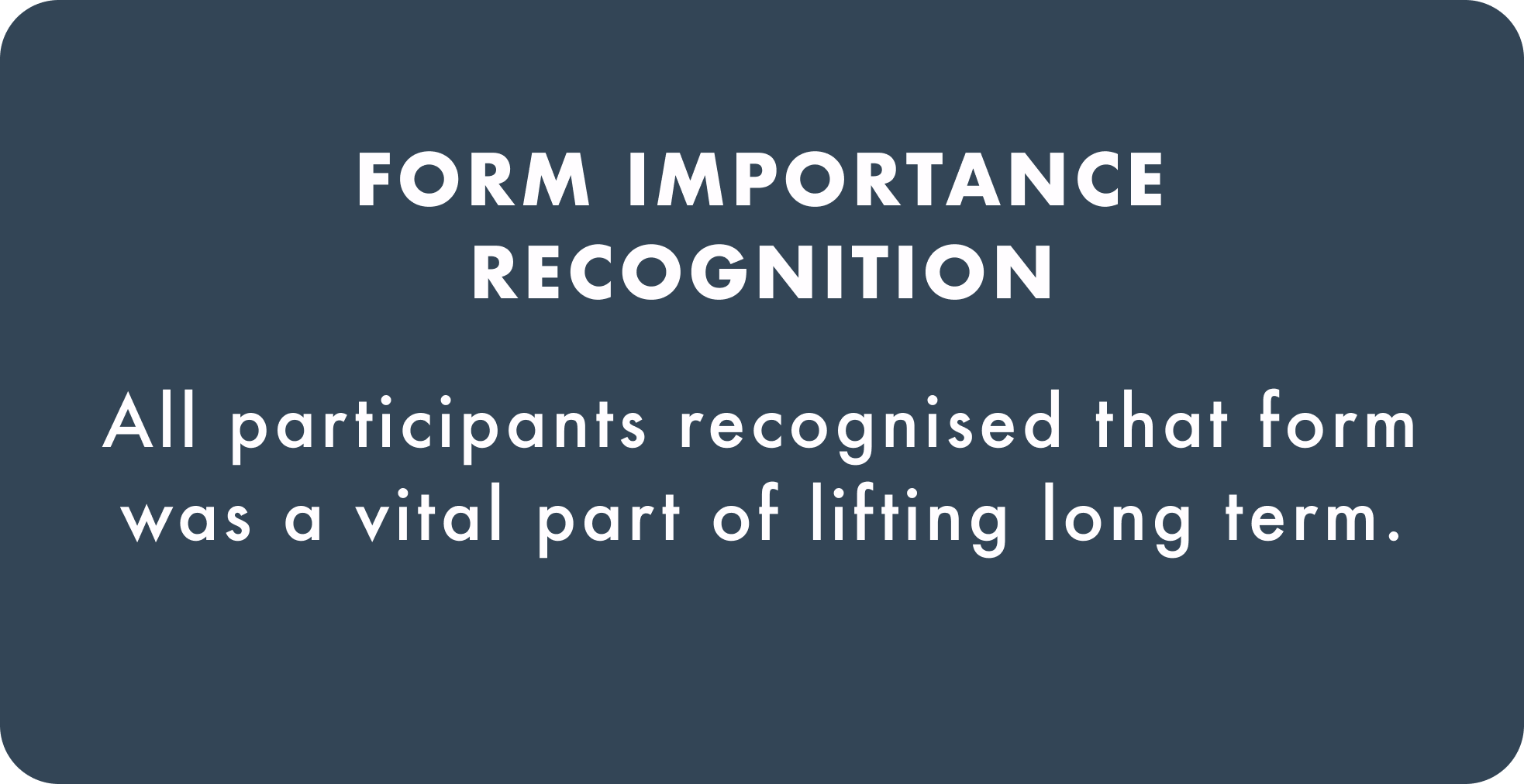
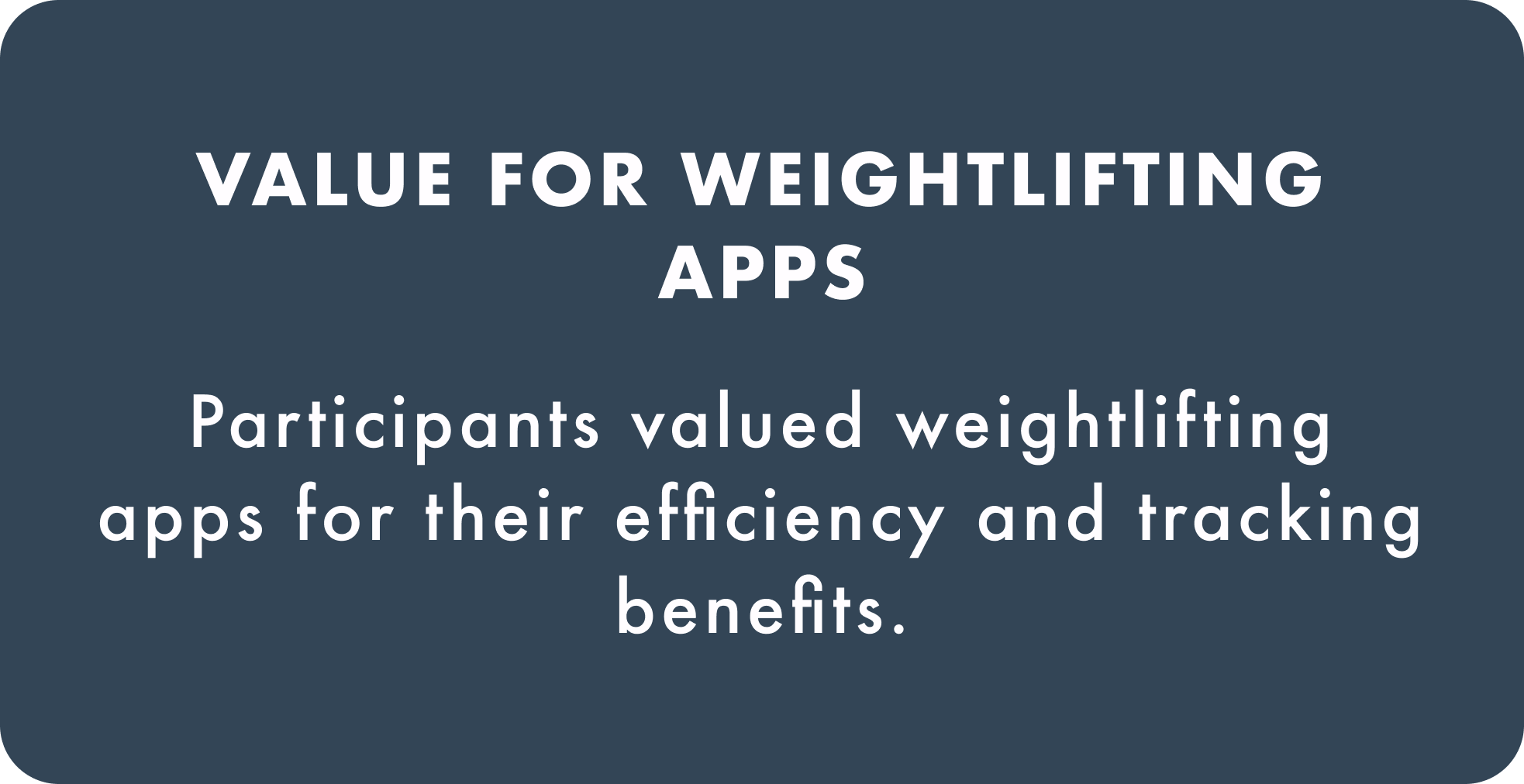
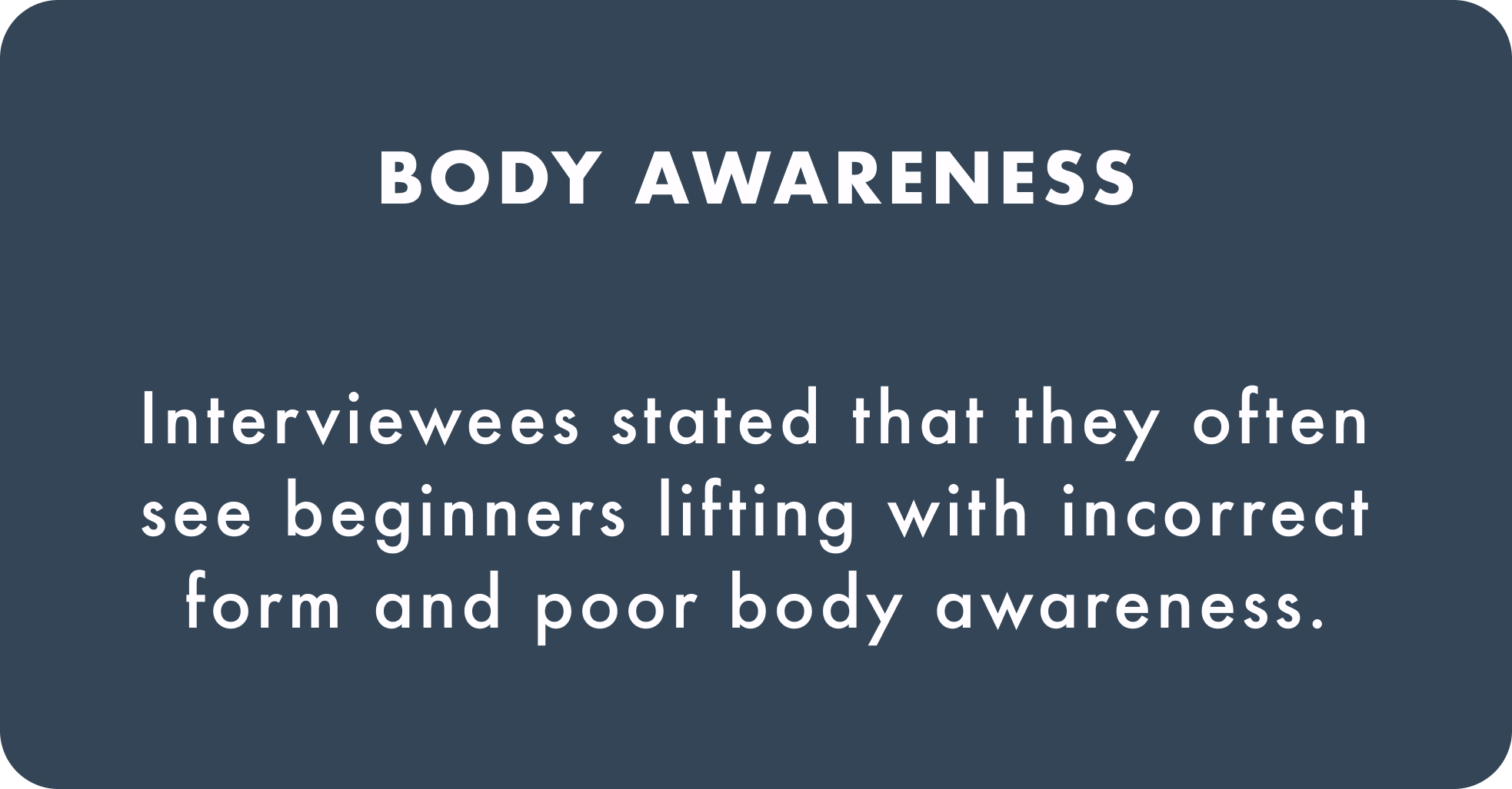
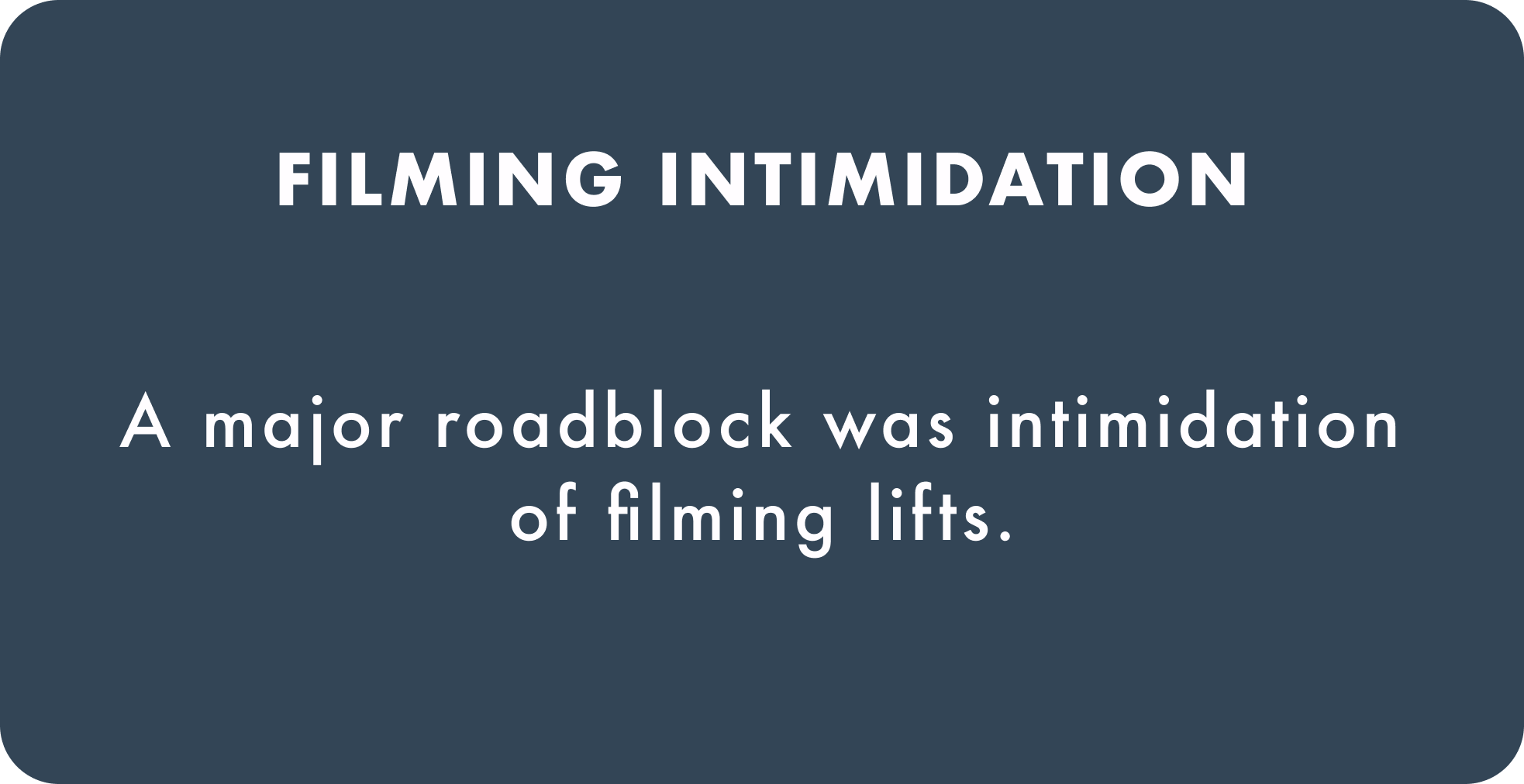
Form Value, Filming Intimidation, and Poor Body Awareness
In addition to a competive analysis, 5 user interviews were conducted via zoom. All participants were of various ages, backgrounds, and locations and had various fitness experience levels. My research revealed that most weightlifters are thinking about form in one way or another while working out and that having a tool to check form is beneficial for lifters of all different levels.
What Does My User Really Need?
Persona / Storyboard
Talking to participants gave me a clearer understanding of the general weightlifter experience and beliefs. This led me to the conclusion that a form feature would be a beneficial add-on to the Strong app. With this in mind, I created a persona/storyboard combo in order to deepen my understanding of the user’s needs, goals, and expectations.
Two personas were developed out of the research serving as a reference point to refer to throughout my design process. It took many iterations and stripping my findings down to create concrete personas for both the beginner and expert lifter.
The Newbie needs to learn with context, encouragement, and additional support. Since they are much more hesitant and inexperienced, with a goal to learn proper technique, it was important to find ways to show them why form matters and to encourage them in filming themselves.
Design Impact:
Created a specific onboarding flow for beginners and intermediate lifters.
Quickly discussed how form prevents injury and is learned over time in onboarding.
Used additional tooltips with a note of encouragement prior to filming and uploading their own video.
The Expert needs to see how they can make small improvements. Since they already have an understanding of why form matters and lifting technique, it was important that this persona was able easily recognise how to perfect their lifts without being bothered by unnecessary information.
Design Impact:
Created a specific onboarding flow for advanced lifters that skipped information about the importance of form.
Designed a side-by-side viewing option so users could quickly recognise differences in their form versus their personalised animation.
Used additional tooltips with a note of encouragement prior to uploading their own video as participants noted filming was intimidating regardless of fitness level.
User Journey / Task Flow
Now that I had a clear understanding of my users’ goals, needs, and expectations I created a journey map and task flow combo to have a clear, visual representation of how users would experience the app feature. This showed me the difference in attitudes and opportunities in both personas as they moved through the form feature.
The Newbie
Building a user journey and task flow for The Newbie persona allowed me to have a clearer understanding of the emotions this user would be having throughout their experience. As they are new to lifting their core emotions would be fear and anxiety, making it important to give them additional support and the tools they needed in order to succeed.
Design Impact:
Make it clear that this feature was for ALL fitness levels, allowing users to choose between beginner/intermediate and expert during onboarding.
Use tooltips to encourage users before they begin the filming process.
Advanced Lifter
In creating the user journey for The Expert, there were recognisable differences between their experience and The Newbie’s. One of the key elements was that this user was beginning their journey much more motivated and confident, aware of the importance of form, and only need additional help to spot technique errors. While they weren’t fearful in their lifting process they experienced more hesitancy and annoyance.
Design Impact:
By creating an advanced onboarding option, this user can skip unnecessary information in the onboarding process regarding the importance of form, only showing them the key info to use the feature.

Building Structure Where Users Can Locate All Pages
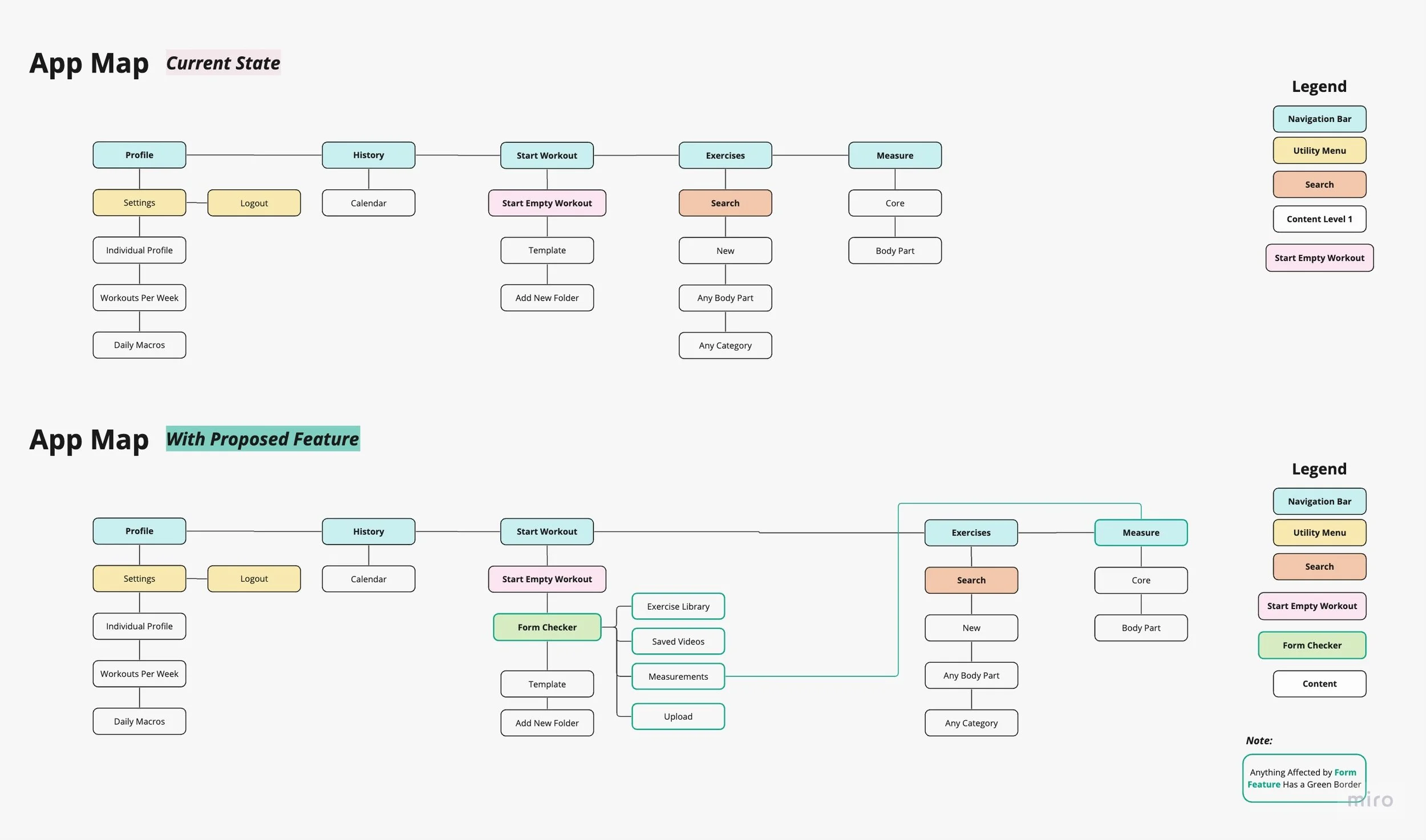
It was important to establish how the form feature would fit into the existing app. Since the Strong App is known for its extreme simplicity, the newest feature needed to fit seamlessly into the overall app layout. I considered creating a new button on the navigation bar but decided against it, to keep the app as simple as possible. Instead, I designed an action button, directly underneath the main workout button.
User Flow
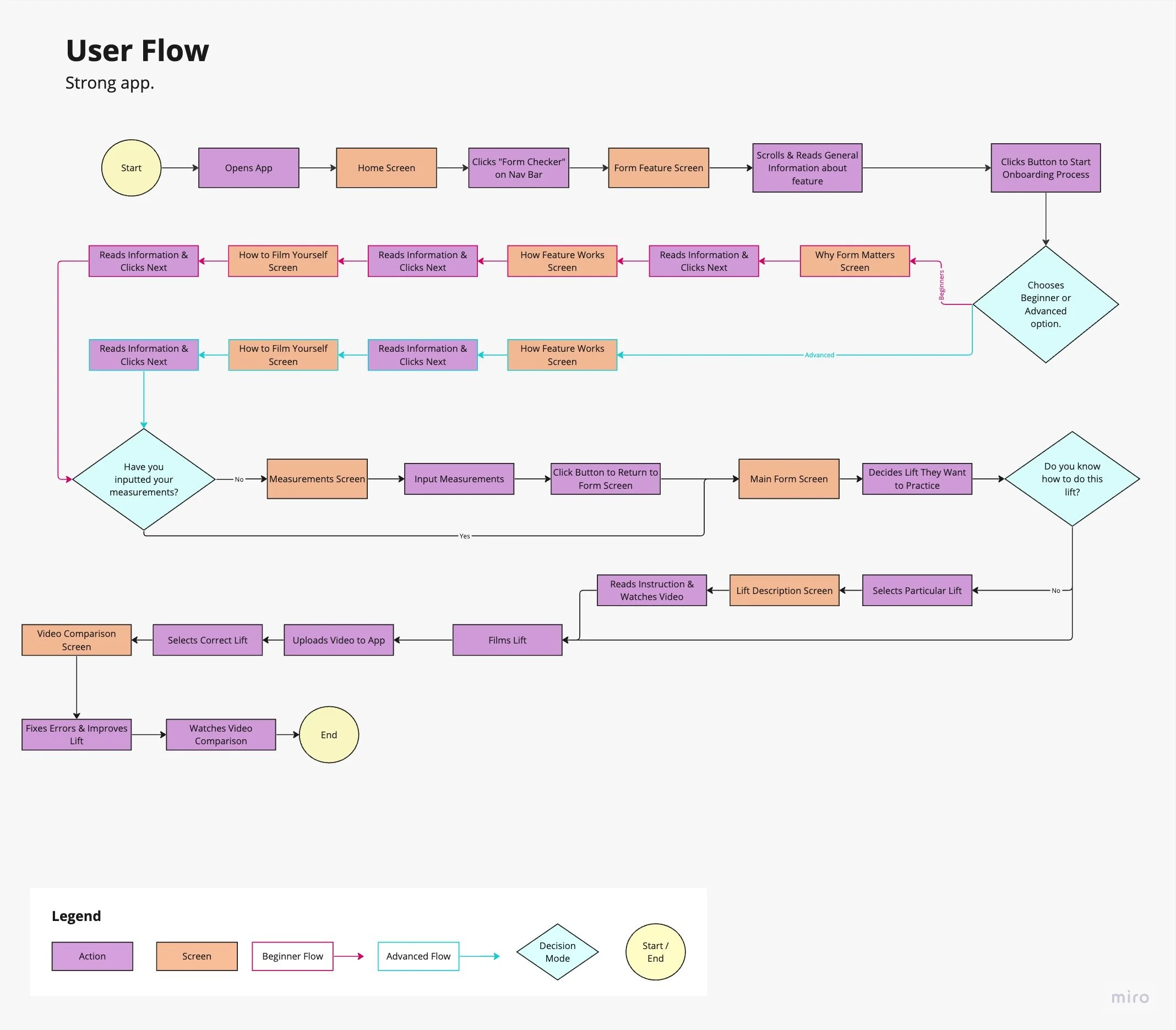
Originally, user flow creation wasn’t on the agenda but as I began to sketch I found myself struggling to know which screens I needed to make and in what order. I decided to build out a user flow which gave me the visual clarity I needed in order to return to sketches and design my flow.
I created two onboarding flows, one for beginners and the other for experts as our research showed that experienced lifters did not need the same information about the importance of form. This allowed more seasoned lifters to move directly to needed information about how to use the feature. My user flow also allowed me to find an initial solution for entering measurement information, where users were redirected to the existing measurement screen and back to onboarding.
Design Limitations
One major aspect of this project is the limitations of creating a feature within an already existing app. The Strong App is intentionally simplistic, its users value having the tools they need to perform their workouts and grow as a lifter without extra fluff. I found it difficult to stay within the confines that this app presented but needed to honor the already existing framework for design.
Final Sketches

Wireframes & Usability Testing
Low-Fidelity Wireframes
From here, I created low-fidelity wireframes of our screens. Keeping in mind the key elements uncovered during research and brainstorming and creating flows and elements for both beginner and advanced lifters.
User Need / Design Impact:
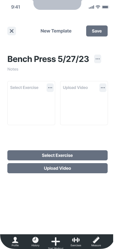
Feature Familiarity: Form checker button under existing CTA button, similar upload button, and used existing measurement section.
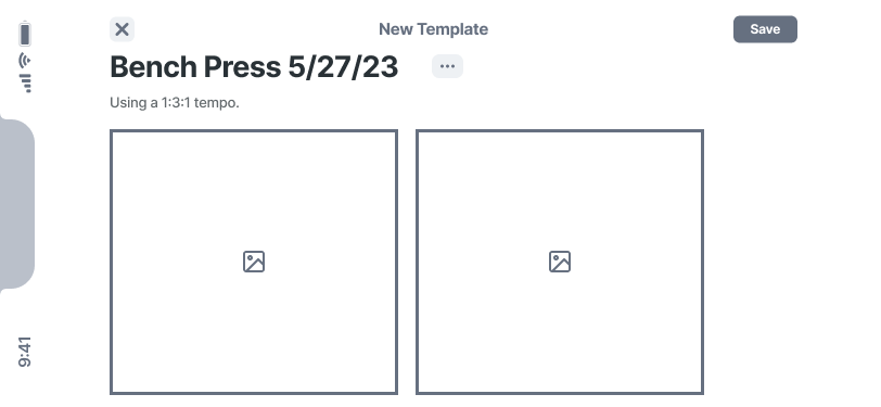
Recognise Lifting Errors: A personalised animation that would fit the individual’s specific biometrics and a side-by-side video viewing option that could also be viewed in landscape mode for a clearer visual.
Main Feature Screen
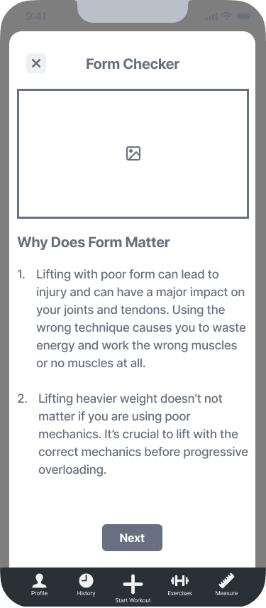
Beginner Onboarding Screen Explaining Why Form Is Important
Onboarding Screen Detailing How to Use Feature and Measurement Requirements
Existing App Measurement Screen Users are Directed to During Onboarding
Feature Upload Screen with Exercise Selection and Video Upload
Final Viewing Screen in Landscape Mode
Usability Testing
After designing mid-fidelity frames, I wanted to be sure that users could easily move through the app and that our solution would meet the goals, expectations, and needs we had uncovered. Conducting remote, moderated testing with 3 participants instructing them to check their bench press form as a beginner lifter I was able to see what pains and frustrations users were experiencing.
Testing Goals
Test to see if users understood the feature concept.
Test to see if users have all the information they need to successfully use the feature.
Test to see if the onboarding process is clear.
Overwhelming Onboarding
Through testing, I found that the onboarding section was the main source of confusion for users. No participants read any onboarding information and did not understand that they needed to navigate to the measurement page to input information needed for their personlised lifting animation. There was also a lack of clarity about how the feature worked and uploading videos.
With this information in mind, I went back to the drawing board, having to hold the users’ needs and the design of the existing app in tension. I came to the conclusion that in order to keep my users engaged I needed to create as few steps as possible and give them the information they needed when they needed it. Rather than dumping all the information in the onboarding process, I decided to only ask necessary preliminary questions in onboarding and place tips elsewhere.
The UI Design I Couldn’t Choose
Designing for an existing app meant that I need to build within the already existing framework provided. This proved to be much more challenging than I had expected as I sometimes felt frustrated by the limitations of the branding and design pre-selected for me. I consistently found myself caught between needing to provide my users with the solution and experience they needed while also holding the existing app in tension. My main goal was not to jolt my users out of their normal experience, the feature was new enough and I didn’t want a different look to confuse them further.
This was accomplished by adding similar CTA buttons and using imagery and copy that fit their branding, direct and to the point. No frills or gimmicks, the information and imagery users needed to workout.

Giving Users Information at the Right Time
With a better understanding of how to build a flow that offered more clarity to our users, I designed high-fidelity screens. It was important that I paired down unnecessary information and created the simplest way for users to move through the onboarding flow to use the app feature. Since users weren’t reading information during the onboarding process I slimmed down the copy and placed key measurement requirements within the flow. I took the remaining onboarding information and repackaged them as tooltips which were placed at the moment when users would need that specific information.
Wrap Up
Project Takeaways
This project was extremely beneficial in giving me insight into what it is like to design for an existing project rather than starting from scratch. In some ways, it is helpful to have an existing framework to design within. It means that I am asking fewer questions about the overall structure, design, and branding. At the same time, it requires creativity and flexibility to create the solution your user needs while honoring the existing architecture.
The other key element of my project was the brainstorming portion after usability testing. I had to cycle through different ideas in order to arrive at a solution for users to have a better grasp of the content originally delivered only within the onboarding process. Doing so gave me a clear understanding of what it looks like to maintain your users’ engagement through the entire flow.
Main Takeaways:
Next Steps
Would I be given more time, resources, and the ability to work alongside the actual Strong app team these are the further steps I would be taking:
Propose a UI refresh. I found that there were inconsistencies throughout the existing app, in color, font, and design. Creating a solid design system would give more clarity to the users as they engage with the app and its form feature.
Follow up with additional user testing to see users’ responses to tooltip popups, ensuring that they are being given the necessary information at the right moment.
Explore other video and animation viewing methods, such as an overlay or reducing the size of one screen to the lower corner.


