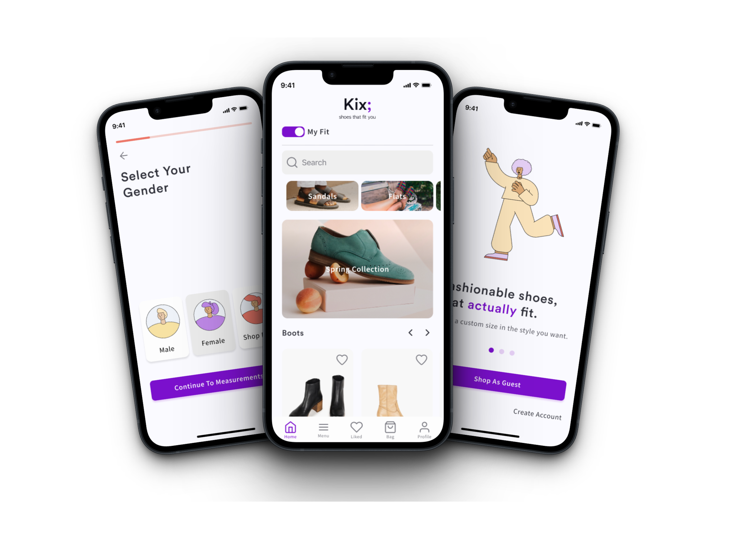
Kix
Using AI Technology to Create Solutions for Hopeless Shoppers
#EndtoEndMobile

Project Overview
Role: Research & UX/UI Designer
Timeline: 5 Weeks
Tools: Figma, Miro, Zoom
Methods: Market Research, User Interviews, Comparative & Competitive Analysis, Surveys, Affinity Mapping, User Personas, Site Map, User & Task Flows, Jobs To Be Done, Mood Board, UI Kit, Paper Prototyping, Low-High Fidelity Sketches, Digital Prototyping, Usability Testing
Problem: Shoppers are Tired of Sacrificing Fit for Style
Imagine you are scrolling through your favorite e-commerce fashion store, browsing for the perfect kicks for your next vacation. And you find it, the shoes designed just for you. You open the product page only to find that there is no possible way these shoes will fit. And that happens every single time.
Unfortunately, this experience is not at all uncommon. The majority of shoe shoppers have a negative experience finding fashionable shoes that fit. We needed to find an app solution for a customizable shoe-shopping experience that not only worked but that users felt was trustworthy.
Target Audience: Men and Women Of All Ages Who are Frustrated with Finding Fashionable Shoes that Fit
The general target audience is those who struggle to find fashionable that fit which can be broken down into two personas:
People who love to shop online.
People who are hesitant to shop online.
Why This Matters: Users Are Hopeless
There was an overwhelming amount of hopelessness we found in shoe shopping and 75% said it is a negative experience for them. This is what drove the project - there is a massive need for inclusive sizing in shoes and no real way for customers to find fashionable shoes that fit.
Project Goals & Objectives:
Solution Preview
Utilise AR Technology to Build Trust with Users
Allow users to find their exact measurements by capturing their foot image, ensuring that their shoe will match their foot type.
Give the option for users to manually enter their measurements or use AR.
Create a Simple Process for Users to Search Only Shoes That are Their Fit
Allow users to toggle their customised fit, giving them the option to easily filter by their fit or to shop all shoes.
Build on optional onboarding where users can scan their feet to find their perfect sizing using their length, width, and arch measurements.
Use Reviews to Help Users Have Confidence in their Purchase
Allow users to view previous customers’ user-generated photos to see how shoes look in person.
Create a shoe sizing review chart so other users can rate how shoes actually fit.
Include product ratings on category and product pages.

Who Is Our User and How Do They Feel?
I Have No Idea Who My User Is…
My biggest problem was really knowing who my target audience was. My assumption was to target women because I believed they cared more about fashion - I needed to see if that was actually true.
Assumptions:
Users would be willing to purchase shoes through an app rather than in person.
Users have a common definition of fashionable.
Users are unable to find shoes that fit and are fashionable.
Users would be willing to purchase shoes at a higher cost in order to have the fit and look they desire.
Objectives
Understand people’s attitudes and processes in buying shoes to determine if the app design is necessary.
Understand the experience of trying to purchase fashionable shoes that fit.
Discover who is in need of customized shoes to determine Kix’s target audience.
Creating Familiarity & Watching Users Shop
I started with marketing research and comparative and competitive analysis. I wanted to see what research was already available and see how other apps were already set up - since Kix would be a new app of its kind, creating familiarity for users was important.
From there, I conducted contextual interviews with 5 participants of various ages, locations, and backgrounds, learning about how people experience shoe shopping and watching them shop online. This allowed me to see subconscious behavior patterns that might not be discussed in a verbal interview. In addition to this, I asked questions about how and why they went about shopping for fashionable shoes that fit.
Competitive & Comparative Analysis
Competitive & Comparative Analysis Takeaways
After reviewing direct and indirect competitors such as Nike By You, Adelante, Zappos, Madewell, and Nisolo I was able to gain a clearer understanding of the shoe industry as well as the strengths and weaknesses of other competitors.
There are very few options for users that don't fit within the "standard" shoe sizes and most of the wider options aren't that appealing. Therefore, there is a great need for a product such as this.
It's important to not overwhelm the user with too much design - but to keep the images of shoes center focus.
Nisolo (a website used by an interview participant) has great product page detail content, which could be utilised in our design.
ThirdLove uses copy that engages the idea of size inclusivity - which is crucial as many of our interview participants have been wildly underserved.
User Interviews Weren’t Answering All My Questions
There was still one problem, I wasn’t confident about who my user was. Market research was aimed toward general shoe shopping trends but not customers with specialized needs. I needed to find a way to nail down who Kix’s target audience was.
I decided to conduct a survey, where I asked questions about gender, age, where participants shop for shoes, shoe shopping experience, and needs for a great fitting shoe.
When My Research Took A Turn
“I know my resistance to trying and trusting buying online is linked with my past experience of buying online and it not working out. If I buy online, I need to see that it’s for larger feet or from someone that has had the same experience as me.”
Research Takeaways
There is an overwhelming struggle and frustration with finding fashionable shoes that fit. 75% of survey participants noted having a negative experience shoe shopping and interviewees stated that they felt hopeless when looking for shoes.
While there are a handful of apps using AR for foot measurements no
e-commerce shoe apps allowed for custom sizing.
The number one feeling users interviewed felt was hopelessness. They have settled into believing there is no good option for them.
This was not a female issue. Surveys were taken by an equal number of men and women who were equally struggling with finding fashionable shoes that fit.
Had I not conducted surveys I would have missed a whole segment of my target audience by making an assumption that this was a problem for females only.

Understanding User Goals and Needs
Having No Idea Where to Go
Now it was time to brainstorm solutions and build out the structural skeleton of the site and I felt stuck. Do we have a quiz? Do we allow users to manually enter their data? What is the process? Is it too overwhelming for users to choose length, width, and arch? Do we use AR as a measuring feature or am I merely attempting to use the newest technology? I kept going in circles coming back to the same place so I did two things.
Going Back to the Research
Width was the main issue mentioned during interviews and surveys and arch size was second in line. Research showed that correct arch sizing was an unmet need of the user.
Decision: Use length, width, and arch sizing. ✅
Users are coming in with a lack of trust that shoes will fit. There was an interest expressed in AR and it would build a greater belief that their shoes would work for their feet.
Decision: Move forward with using AR. ✅
Getting Feedback from Designers
It was at this point that I began reaching out to designers for feedback on my process. Being open to input from others kept me moving forward and allowed me to see my work, user, and problem from many angles.
A fellow designer encouraged me to take a step back and take a bird’s eye view at my users’ needs without trying to come up with a solution. I did this using the Jobs to Be Done method.
Seeing the flow simply laid out gave me confidence that I wouldn’t get lost in details that weren’t research-based or solutions focused. Now I knew could create a solution that users needed rather than what I wanted.
Users needed to be able to:
Determine their shoe size.
Find the type of shoe they wanted.
Purchase their selected shoe.
From here, I used How Might We’s in order to brainstorm as many solutions as I could that would help our users achieve their goal of finding fashionable shoes that fit.
User Need / Design Impact:
Trust Factor: Product images, user sizing reviews, an AI measurement option, custom shoe measurements, and empathetic branding.
Perfect Fitting Shoe: Length/width/arch sizing options, free returns, and shoe measurements in onboarding.
Show They Have Fashionable Options: Trendy branding and copy and keeping imagery fun, young, and cool.
Rerouting and Testing User Flows
After creating a sitemap, user flow, and task flow I went into my sketches. My research showed that users needed confidence that the shoe they would purchase would truly fit. For that reason, I knew that I wanted to have an initial onboarding flow for users to find their exact measurements but I still felt unsure of some of my design decisions. I realised that the reason I was stuck was that I didn’t have a solid enough Information Architecture. I decided to test my user flow with someone who knew nothing about the app. This is where my structure and project began to come to life.
Testing Built Confidence In My Structure
There was frustration in choosing to shop as a guest at the beginning of the flow and at checkout.
The participant expressed he wanted as few steps as possible.
A few steps were mistakenly out of order and needed to be switched.
I had never tested a user flow before but doing so helped me see how the flow would be experienced ahead of the design process and helped me catch my own errors and mistakes once I was verbalizing the steps.

Designing Made Easy
Being sure that my user flow was exactly what I wanted, set me up for the design process. As I began to sketch and build out my low-fidelity wireframes, I was now confident of what elements needed to be included or omitted throughout the flow
Allowing Research to Shape UI
I worked on branding and UI throughout my time building the information architecture. First, I completed a branding questionnaire to better understand my target audience and how we wanted to communicate with users based on their needs, goals, and expectations.
Brand Adjectives:
Our users are an underserved group without any real options for the product that they need. With this in mind, I crafted our brand adjectives as a response to the hopelessness and lack of trust as seen in the research.
Colors:
I selected colors that I felt correlated with our brand adjectives. Purple brought a sense of creativity, orange represented being empowered, and yellow showed a hopeful sense of belonging.
Logo & Text
Taking the time to look at competitor logos, I recognized that shoe industry logos are often black and simple without many illustrations distracting from the company name. Staying in the same vein, I added a semicolon, representing the idea of continuation. As the research showed that the large majority of those looking for shoes feel hopeless, this semicolon and Kix represent a continuation of their experience. That there is an option for them.
How I Would Approach UI Differently
In approaching UI for this project I found two different schools of thought. Some designers create a full design system prior to putting pen to paper and designing any wireframes. Before they have seen their flow laid out they know what colors, imagery, and buttons they will be using. Other designers flip the process and design flows first, then fill in the gaps. Were I to do this project over, I would have opted for the latter. Because I created most of my UI work first, by the time I was designing high-fidelity frames I found myself redoing large pieces of what I had already done before. Having a clearer picture of how UI would fit into my existing flow would have saved me time and resources in the long run.

Wireframes and Usability Testing
Now that I had a strong understanding of the user flow and branding I designed high-fidelity wireframes.
I used inviting, trustworthy, and hopeful illustrations to match key brand adjectives.
A progress bar was placed in onboarding to help users recognise where they were in the flow and to prevent drop-off rates.
I chose imagery that clearly illustrated how to scan feet for users to feel confident in using the AI measurement feature.
Filter tags were used during the shopping screen allowing users to see their preselected measurements and add any additional ones as well.
A swipe-to-delete feature was used on the shopping bag for a faster shopping experience which was seen during the competitive analysis.
Usability Testing
I wanted to be sure that users could easily move through the app and that our solution would meet the goals, expectations and needs we had uncovered during research. Conducting remote, moderated testing with 3 participants I gave the prompt to look through the app and decide if they would like to purchase a pair of boots.
Testing Goals
Test that users could easily move through the onboarding process and understand how to use the AR feature. (Note: I did this by having users show themselves filming their feet based on the instructions given.)
Test that users would trust the Kix app to make a purchase.
Test that the checkout process is clear.
Smooth User Testing
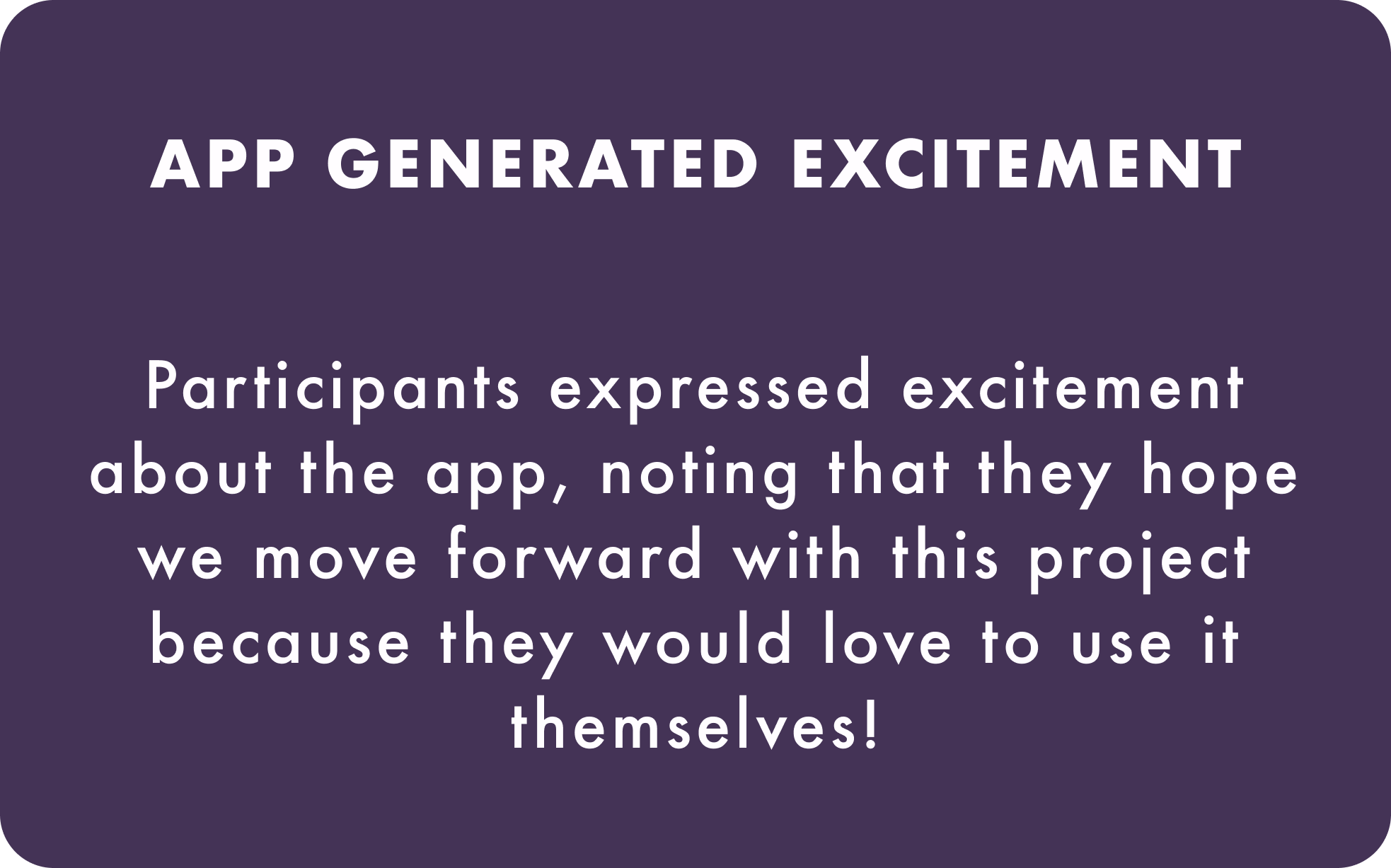
I was delightfully surprised at how smoothly user testing was, which I believe is due to the solid information architecture. These were the overall usability test findings:
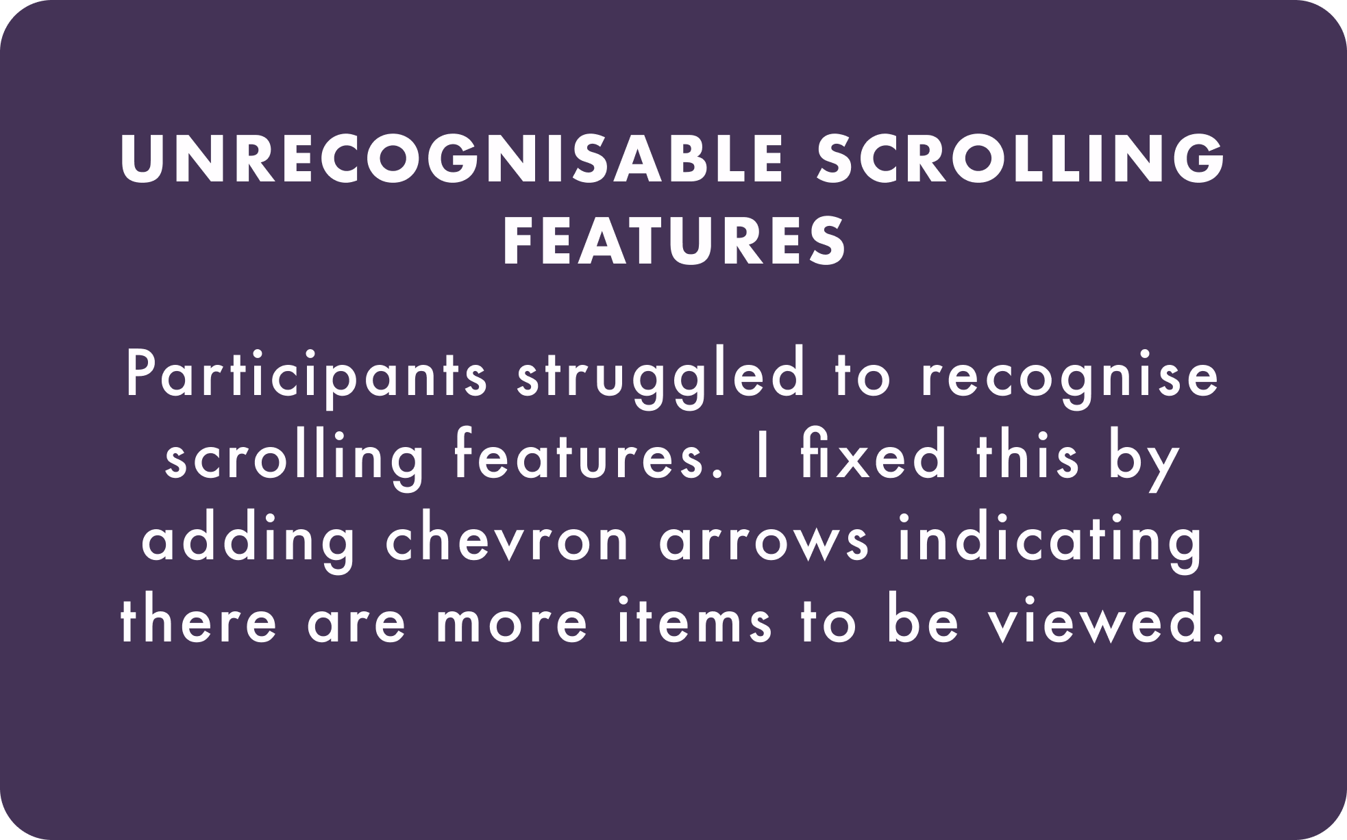
Indicating Scrolling Features
With a clearer understanding of how users were experiencing the user flow and the adjustments that needed to be made, I designed the final high-fidelity wireframes. The main problem issue that needed to be addressed was the two locations users were unaware of more items to be viewed. While this wasn’t a problem for the top category scroll as the carousel image was visible in the margin, the following shoe categories and product images required chevron arrows indicating a scroll feature.
Wrap Up
Strong IA Provided A Great User Experience
I went into the Kix project expecting it to be heavily focused on UI and was surprised by how information architecture played a key role in setting up the success of my prototype. Now I can easily see the value in ensuring a solid foundation allows all other steps of the design process to move smoothly.
Main Takeaways
Next Steps
Would I be given more time and resources these are the further steps I would be taking in the Kix project:
Follow up with further UI work, creating a stronger Design System based on the research, branding questionnaire, and mood board.
Improve copy to infuse brand attributes throughout the wireframes, building a deeper sense that users’ problems and frustration are understood.
Complete further user testing with participants who struggle with very specific shoe sizing needs. Doing so would allow me to see if they feel they have all the needed information and trust the app enough to make a purchase.


