Farm Fresh
Helping Users to Buy Meat from Local Farmers
#ResponsiveDesign
Role: Research & UX/UI Designer
Timeline: November - December 2022
Tools: Figma, Miro, Zoom
Methods: Observational Research, User Interviews, Comparative & Competitive Analysis, Empathy Mapping, Affinity Mapping, User Personas, User Journeys, Site Map, User & Task Flows, Mood Board, UI Kit, Paper Prototyping, Low-High Fidelity Sketches, Digital Prototyping, Usability Testing
Project Overview
Please take note that the website's initial name was Entre Ciel & Herbe, which was later changed to Farm Fresh.
Problem: Branding, Structure & Communication Confusion
Farm Fresh is a startup enabling consumers to buy local, organic meat directly from Swiss farmers. After conversing with their customers, I identified pain points in their current website related to:
Unclear Branding & Logo Readability
Complex Site Navigation
Service Understanding Gap
Product Selection/Usage Ambiguity
Target Audience: Vaud Meat Consumers
The general target audience is those who eat meat in the Swiss Vaud region which can be broken down into 2 personas:
Individuals seeking convenient access to premium meat.
Those who prioritize supporting Swiss farmers.
Why This Matters: Fostering Farmer Dignity and User Impact
Current restrictions strain farmers' income. Farm Fresh restores dignity to farmers and encourages local impact through customer spending.
Project Goals & Objectives:

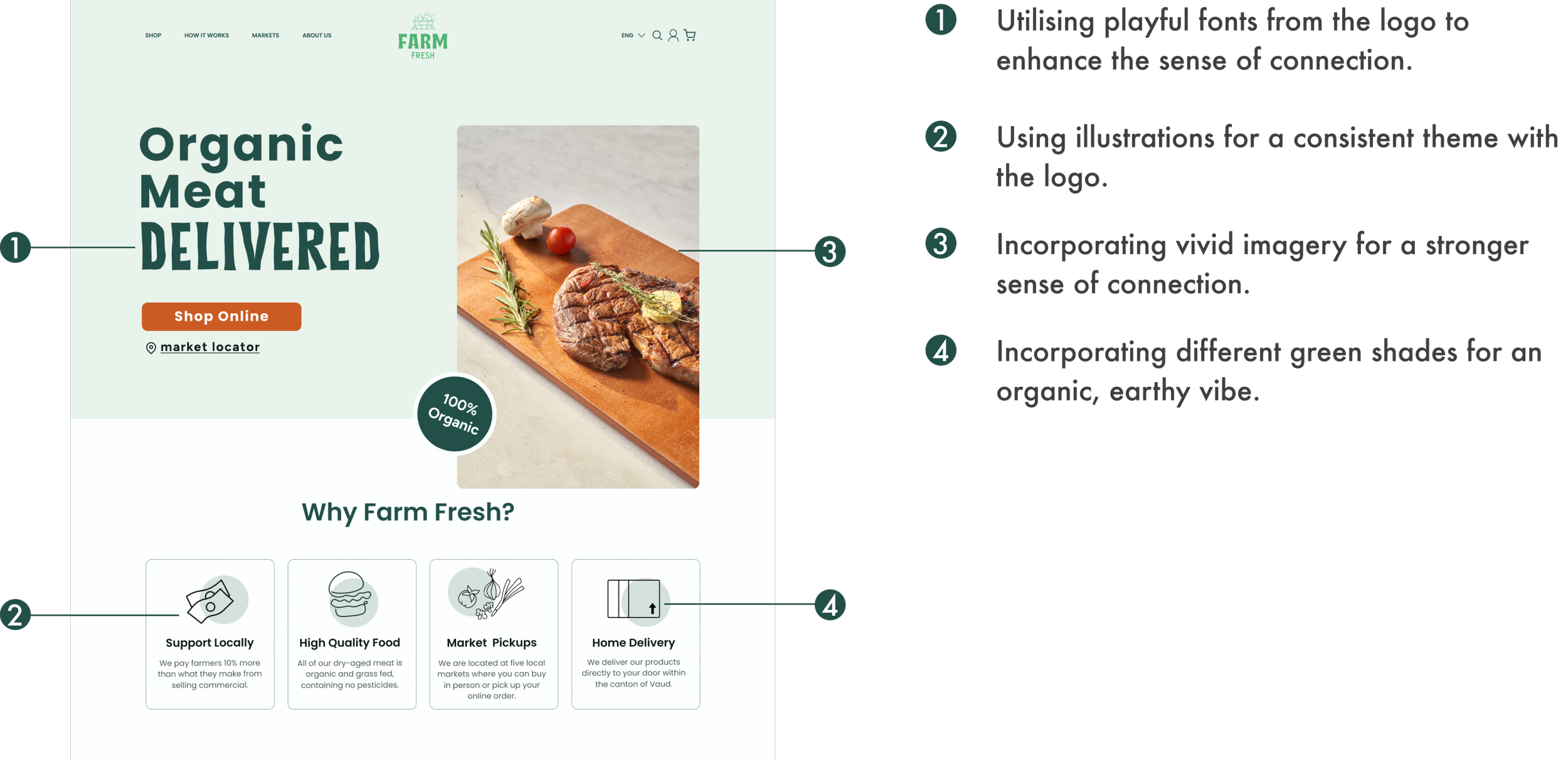
Solution Preview
Design for Clear Direction Communication
Employ visuals to reinforce the company's purpose.
Use diverse image and button states to guide users.
Convey friendliness and accessibility through illustrations.
Respond to User Purchase Questions
Add cooking and storage info on product pages.
Enable a Gram Assistance pop-up.
Enable users to view producers for each product.
Include Shop and Markets on the navigation bar.
Highlight the product near the page's top for easy discovery.
Add a "How It Works" section to explain company operations.
Establish User-Guiding Structure.
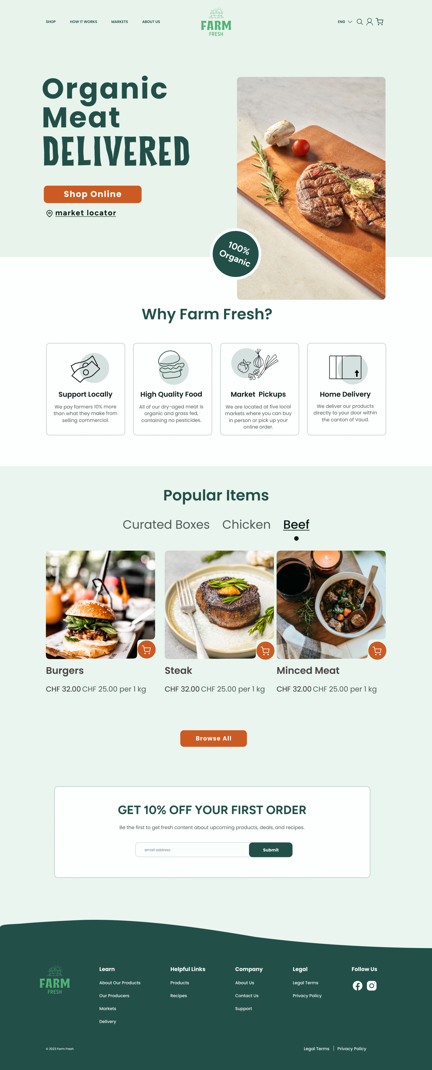
Previous Site vs. New Design
Research: Understanding How Customers Feel About Purchasing Local, Organic beef.
Keeping Assumptions In Check
I initially acknowledged my preconceptions and biases regarding users' issues and needs:
The website's primary function is online beef sales.
Limited beef purchases stem from cost and dietary preferences.
Beef sales suffer due to quality options at local grocery stores.
Key Questions:
Evaluate beef-buying preferences to decide if a website redesign is necessary.
Evaluate website and branding's communication effectiveness, to decide if a brand redesign is required.
Going to Markets & Other Research Methods
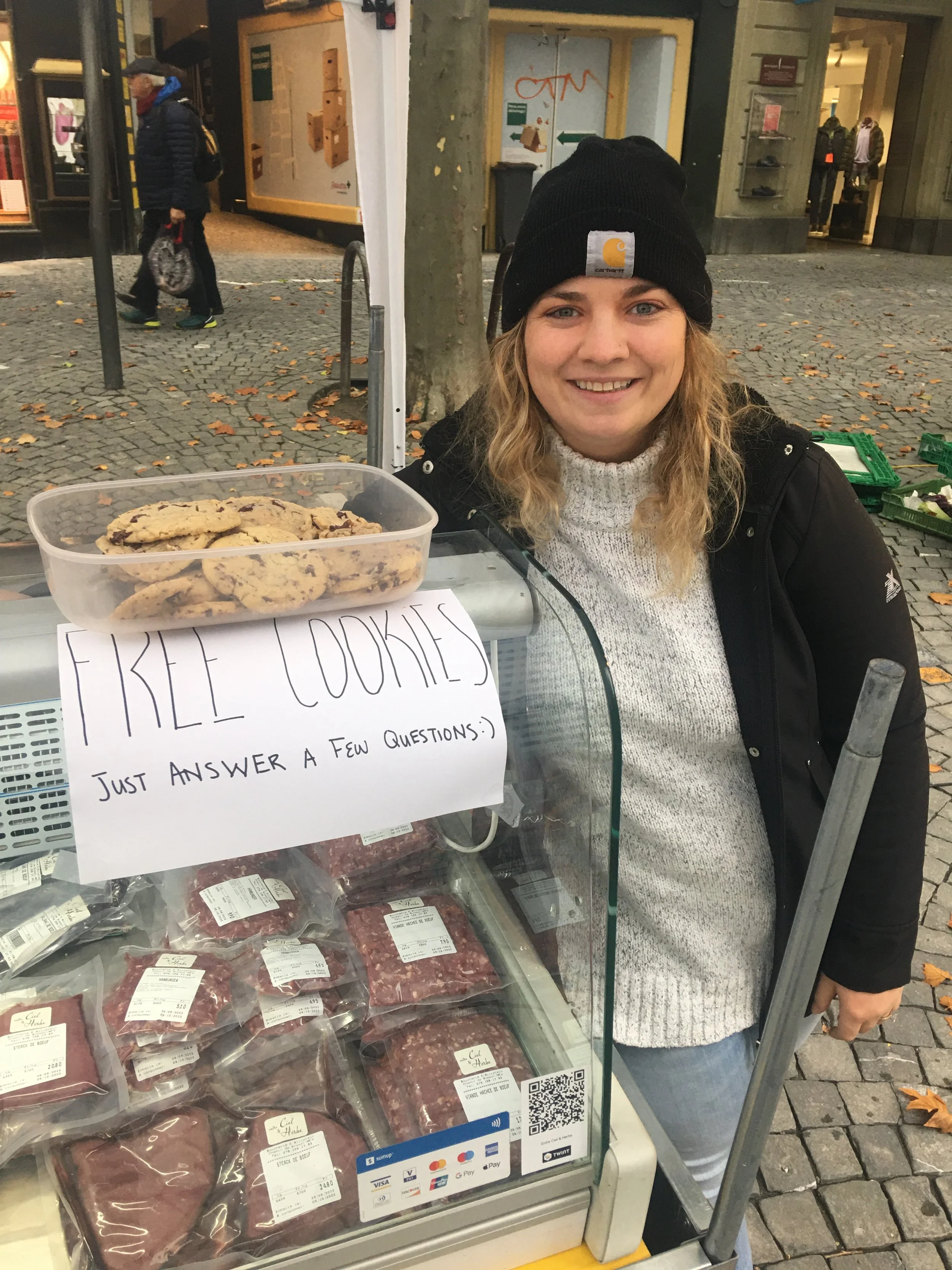
To gather answers, I went to the nearest market with homemade cookies and a sign saying, "Free cookie for answering questions." And it worked.
I furthered my research using:
Observation & Informal Interviews at Local Markets
Baseline Testing the Current Site
Competitive & Comparative Analysis
Formal Interviews via Zoom
I then reviewed my goals, objectives, and assumptions to stay focused on my initial intentions.

Navigating Findings & Rerouting
"I aimed to uncover user motivations beyond their actions."
Feeling overwhelmed by my extensive research, I needed a visual representation. I created an affinity map by categorizing my notes from each interaction using post-it notes.
Learning from Mistakes
I attempted to deepen my research with an empathy map using predetermined categories. However, I found this approach to be restrictive and less effective than the flexibility offered by the affinity map for logically grouping patterns.
Insights: Confusion in Branding, Structure, and Communication
We conducted in-person interviews with 10-15 market shoppers and 5 online interviews. Participants varied in age and background, residing locally and consuming meat. The research revealed the need for a website redesign and why local customers are interested in buying meat.
“If I come to Entre Ciel & Herbe and you know what I need, it’s much easier for me.”
Understanding User Needs, Goals, and Expectations
Empowering Users with Easy Access to Purchase
My research provided insights into our user base. I then created user personas, identifying two main groups: those seeking quality products and those supporting the Swiss economy. These personas and journey maps now serve as valuable long-term assets, helping us understand user needs and processes accurately, free from personal assumptions.
Katinka needs easy access to the kind of product she wants and an understanding of how to cook different cuts. Since she will choose what’s closest in proximity it was important to create multiple purchasing options, whether that was delivery or a market pickup.
Design Impact:
Online purchase with market pickup option.
Highlight delivery on the homepage.
Including recipes, storage, and cooking instructions on product pages.
Dan seeks to support local Swiss farmers and make environmentally responsible purchases. This persona underscores the importance of transparently conveying the necessary information upfront.
Design Impact:
Homepage copy emphasizing support for local farmers.
Included producer details on product pages.
Created a market pickup option.
Visualizing User Processes and Requirements
Katinka Lazarini - Fast Pacer
Based on the persona, I crafted a scenario of a user hosting dinner guests, seeking a convenient product search without visiting the market. This guided me in formulating user questions and identifying points to fulfill their needs along their journey.
Design Impact:
Adding a grams-per-person assistant tool to all product pages.
Allowing users to easily see when cuts are out of stock.
Dan Rimaz - Community Spirit
Using Dan's persona, I developed a user journey based on the scenario of a user buying meat for his family without visiting a grocery store, a common theme in user interviews. This helped me identify the necessary information for him to make an informed choice between pickup and delivery.
Design Impact:
Let users choose pickup day and market location at checkout.
Added a "How It Works" section on the landing page, clarifying delivery and market pickup options.
Prioritising Features by Research and Resource Availability
At this stage, I used research insights, personas, and journey maps to create a product roadmap. It highlighted the importance of product details, market listings, producer information, and how-it-works pages. While new product imagery was beneficial, it would be deferred until more resources were available.

Building Structure Where Users Can Locate All Pages
Interviewed users highlighted a need for clarity in site navigation. To address this, I created a simplified and informative sitemap. Multiple iterations were made to streamline the navigation bar, focusing on key items mentioned in user interviews, including finding markets, learning about the company, and locating products.
Users required effortless access without the need for additional searching.
Creating Clear & Consistent Design
My research showed that our competitors had trouble with consistent branding. So, I started by figuring out Farm Fresh's identity before diving into the design. I created a list of what they weren't to guide me in defining what they were.
Knowing what the branding was not is just as important as knowing what it was.
Earthy NOT Corporate
Honest NOT Evasive
Organic NOT Unnecessary
Friendly NOT Luxurious

Four-Step Sketching with Different Inspirations
I had a four-step process for sketching to encourage creative thinking beyond traditional food company aesthetics.
I sketched 8-10 designs inspired by various website examples.
I noted my favorite parts while reviewing the sketches.
I created a fresh sketch by combining these varied elements.
I iterated through this process until all pages were sketched.
Process Overview:
Initial Sketch Ideas
Final Sketches
Updating Name, Logo, and Design Based on Resources
For UI design, I selected a light, friendly theme with green and earthy colors based on customer preferences for a welcoming, organic feel. I kept the current product photos until we have resources for new ones.
In our user interviews, I noticed that participants struggled with both recalling and reading the company's name. To support the company's expansion beyond the French region, we selected an English name that encapsulated their product diversity and mission. I then partnered with an agency to create a new logo that not only boasted readability but also vividly depicted the company's offerings, creating an inviting impression.

Missing Sign Ups & Clear Filters
Low-Fidelity Wireframes
I started by making simple sketches of our screens and tested them with users. In the initial tests, users had trouble finding important information like market locations, unavailable items, and understanding delivery options. To address these issues, I made changes using different design elements.
User Need / Design Impact:
A sustainable and ethical product: Scrolling banner on the landing page, detailing that products are pesticide-free, organic, and grass-fed.
Product acquisition comprehension: Delivery is mentioned in the hero image, market page, how we work section, and about our products page.
Comprehending product usage: Storage, recipe, and cooking information on product pages.
Landing Page
How It Works Page
Shop Page
Product Page
Login Page
Mobile Screens
Selected Mobile Screens
Low-Fidelity Usability Test Findings
I decided to conduct initial usability testing with low-fidelity screens to prevent me from using unneeded time and resources as I continued to design the user interface. When testing remotely with 3 participants I found that:
Users would miss the 10% off sign-up if it was only at the bottom of the screen - we needed a popup or something similar.
There needed to be clearer filter sections.
Our checkout process was mostly smooth but needed more spacing in the design.
Using Illustration & Clear Direction
Next, I designed the initial version of the high-fidelity screens using testing feedback.
I used illustrations to make the website friendlier and easier to approach.
I deliberately used red and a faded image to indicate out-of-stock items because identifying availability was an issue during baseline testing.
I included drop-down menus on the product page for cooking tips, recipes, and gram assistance to help users with online beef purchases.
High-Fidelity Usability Testing
I conducted remote usability testing with 3 participants to finalize the prototype. They were instructed to explore the website naturally, as if they were considering purchasing meat for an upcoming dinner, without specific step-by-step guidance.
Testing Goals
Test if users understands the product concept.
Test if the user has enough information to buy our product.
Test if the checkout process clarity.
Annoying Pop-Ups, Cost, and Choosing Grams
In usability testing, users were frustrated by 3 main issues: unclear delivery and market options, the need to select grams along with package quantities, and a desire for a simpler checkout process. They also wanted faster access to products on the landing page and the main shop.
Banners, Reinforcing Delivery Options & Drop Downs
With a clear grasp of user frustrations and needs from usability testing, I crafted the final high-fidelity screens.
User Frustration / Design Impact:
“This popup is annoying.” Replaced popup with a banner.
“I didn’t realise you delivered.” Swapped out previous header image with delivery illustration to reinforce delivery option.
“I feel like I have to scroll to get to your products.” Moved products closer to the top of the screen on landing page and minimised the header screen on the shop page.
“I would need to know how much I am paying by the gram.” Changed pricing to show per 100 grams.
Selected Screens
UI Refresh
Upon revisiting the project, I conducted a thorough UI overhaul, which encompassed implementing the name change and incorporating the updated logo. This revamp included the integration of higher-quality imagery, the introduction of a lively orange accent, the harmonization of various shades of green, and an update to the project's fonts throughout.
Wrap Up
Project Takeaways
As I have a personal connection to this project, I recognized the importance of relying on research and seeking feedback from others to prevent my assumptions from influencing my design decisions. Despite the temptation to be protective of my users or design, I prioritized letting the research guide me toward the actual solutions users require.
Next Steps
As we proceed with this project, here are the upcoming steps before its launch:
Arrange for professional photographs of each product and its packaging to be taken.
Build out the remaining pages for all products, recipes, etc.
Help implement a QR code scanning feature for accessing related recipes.
Create screens for mobile and tablet site versions.


